This project focuses on redesigning the LINE app to create a more elder-friendly user experience. While LINE is widely used in Asia, we noticed that many elderly users around us feel hesitant to adopt the app due to its complex navigation and unclear functionalities. The redesign focuses on making the interface more accessible, streamlining interactions, and creating an intuitive experience that feels natural and easy for senior users.
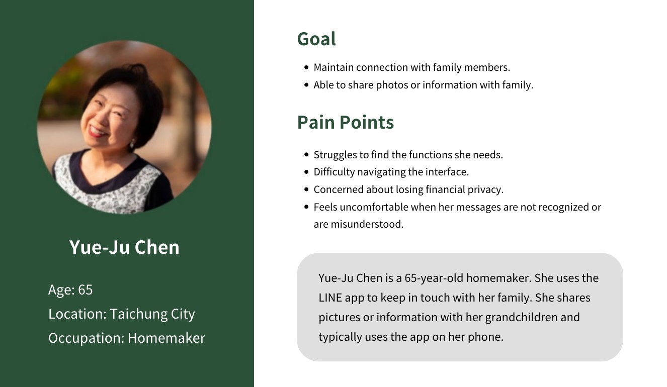
Adopting a user-centered approach, we observed and engaged with elderly users (60+) to understand their interactions with the LINE app. Through interviews and surveys, we identified key pain points such as small text, confusing icons, and complex navigation. Persona was created to reflect these insights, ensuring the design stayed closely attuned to the authentic needs of users.
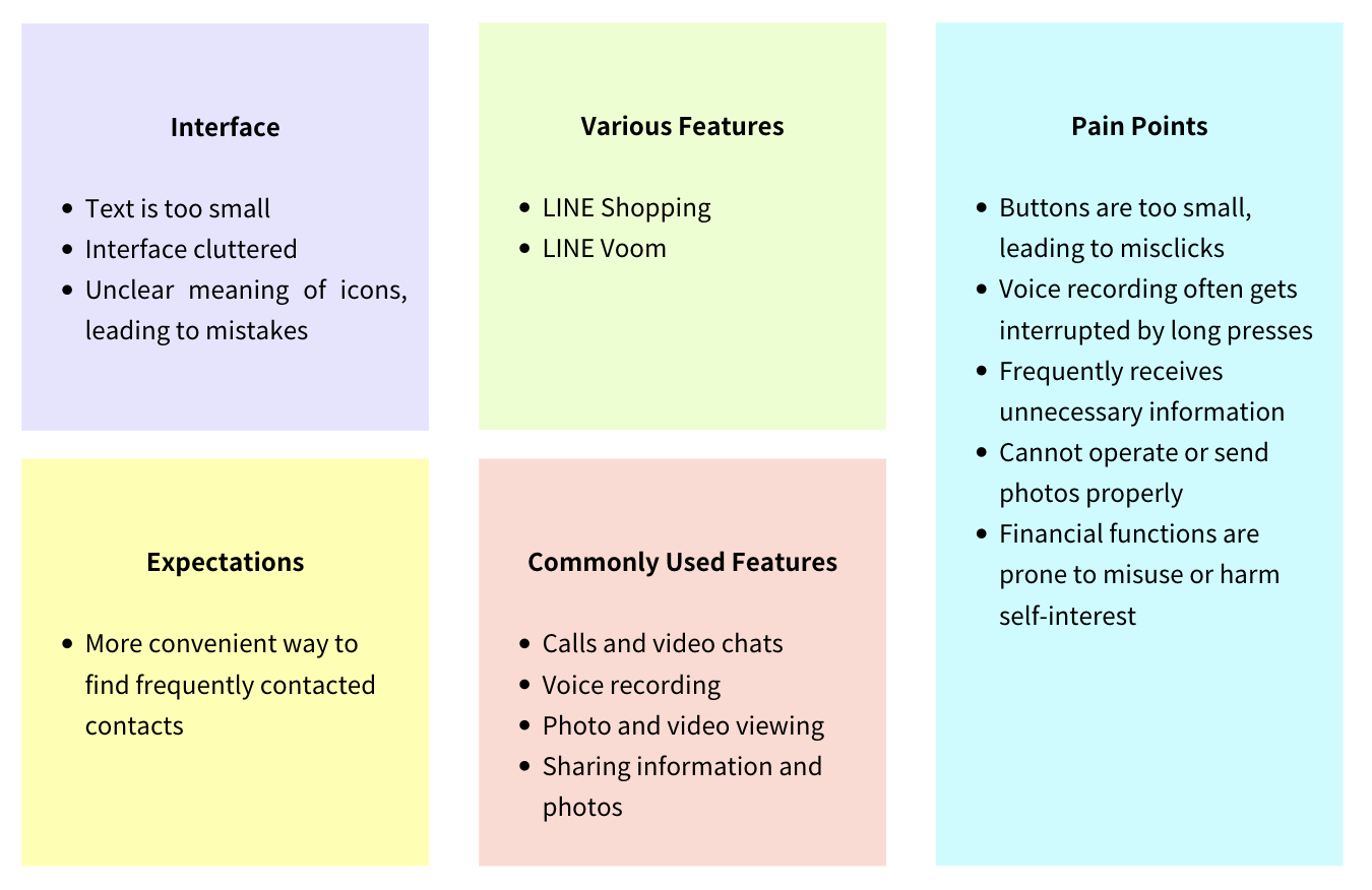
Focusing on the challenges of legibility and navigation complexity, we set the design goal of creating a simplified and accessible interface that better serves the needs of elderly users.
From a foundation of empathy and observation, we explored solutions like larger fonts, simplified navigation, and guided onboarding. Low-fidelity wireframes were created to visualize and refine these ideas.
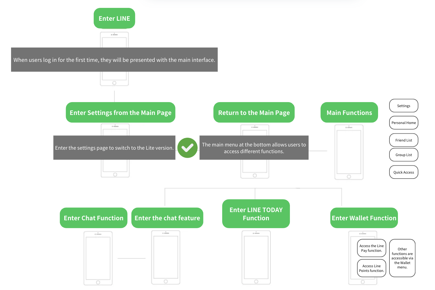
High-fidelity prototypes were developed, featuring increased font sizes, improved contrast, and unified iconography. New features such as shortcuts and reading modes were integrated to address usability barriers.
Usability testing with five elderly users revealed significant improvements in reducing confusion and enhancing their task completion rates. Based on their feedback, we iterated further, simplifying the voice command feature for greater intuitiveness while refining other aspects for an optimal user experience.
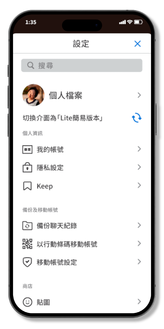
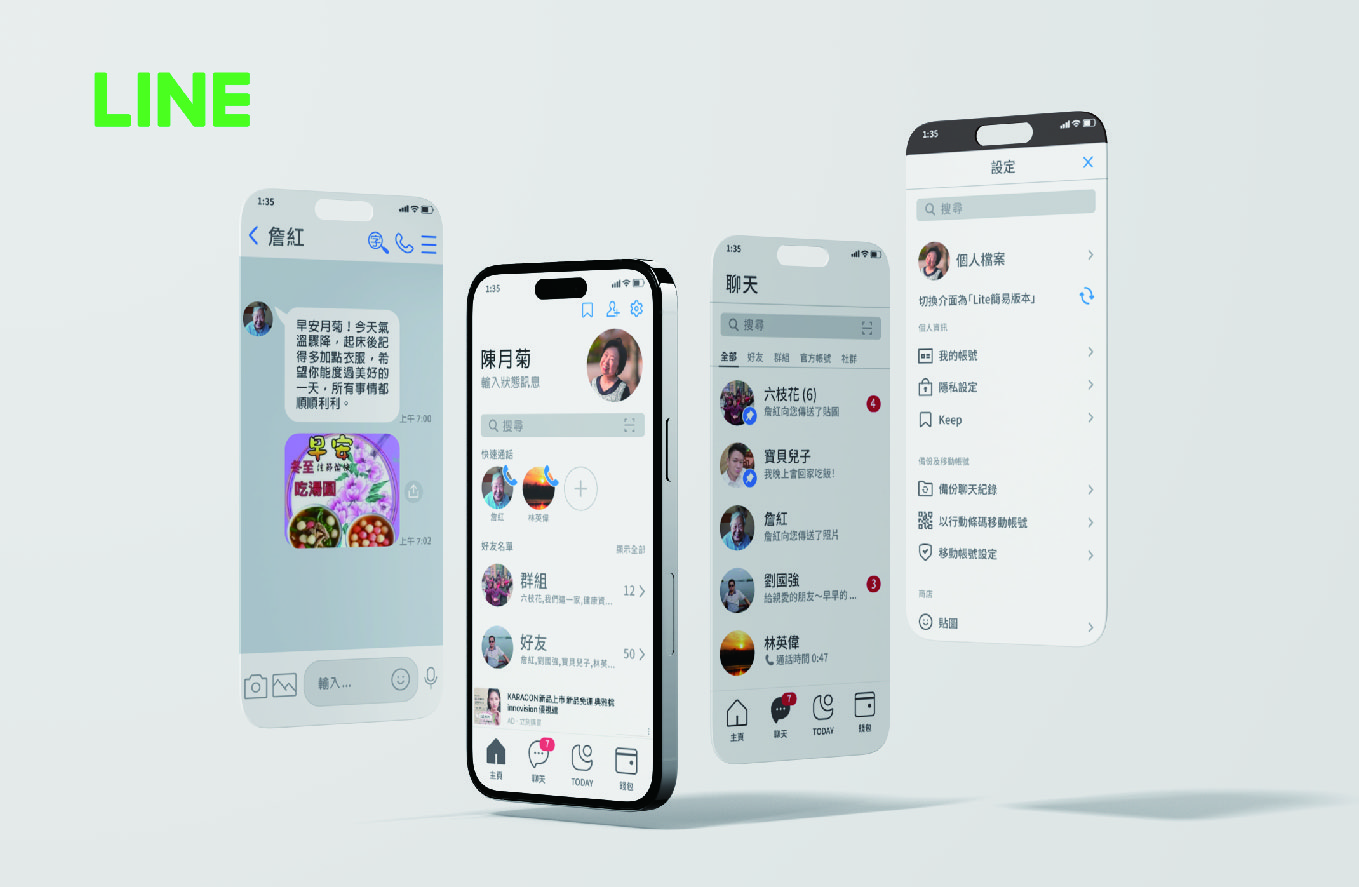
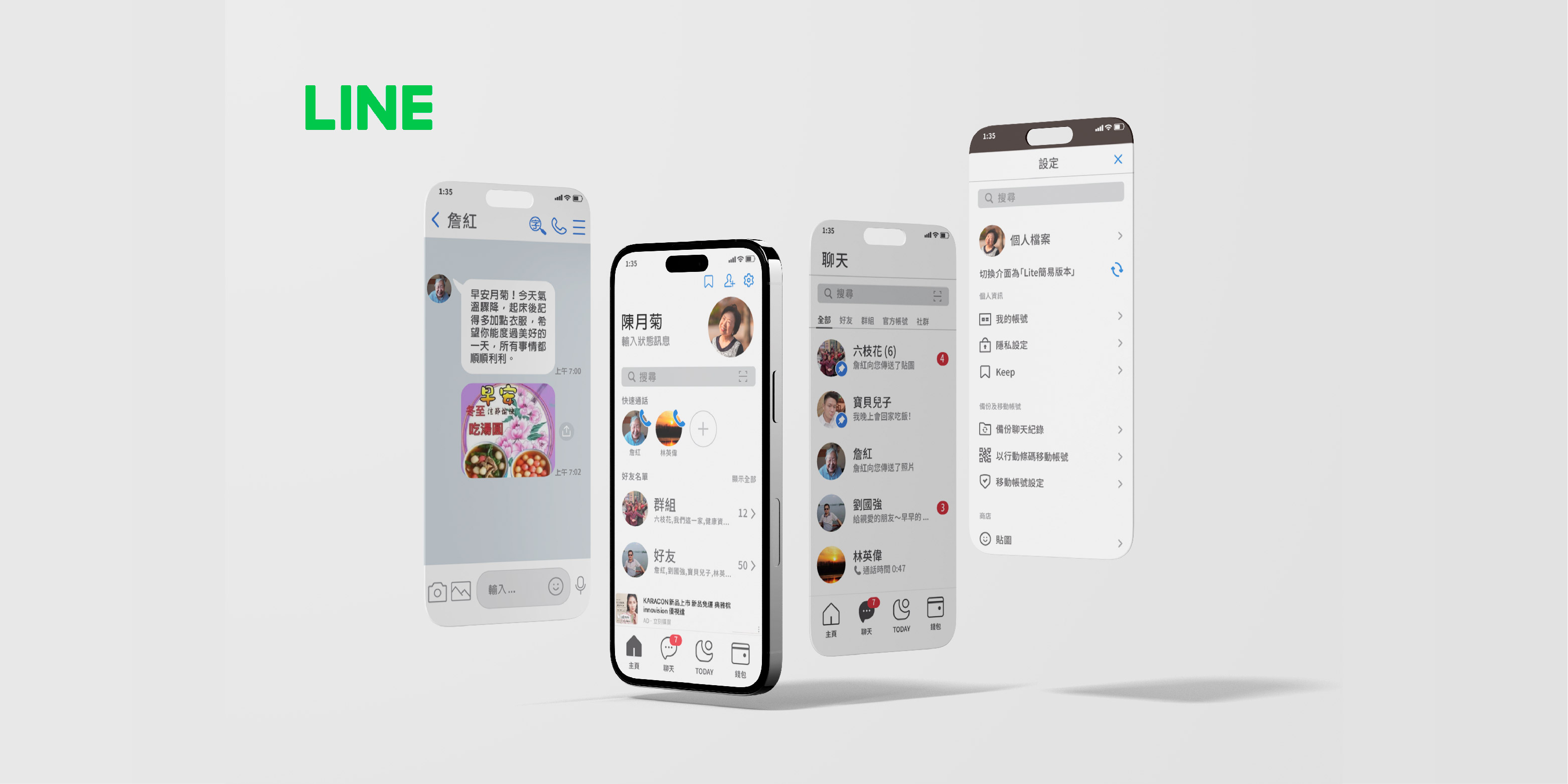
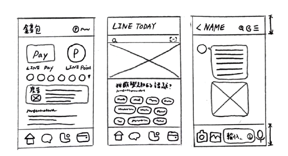
‧ One-tap switch to simplified mode via settings.
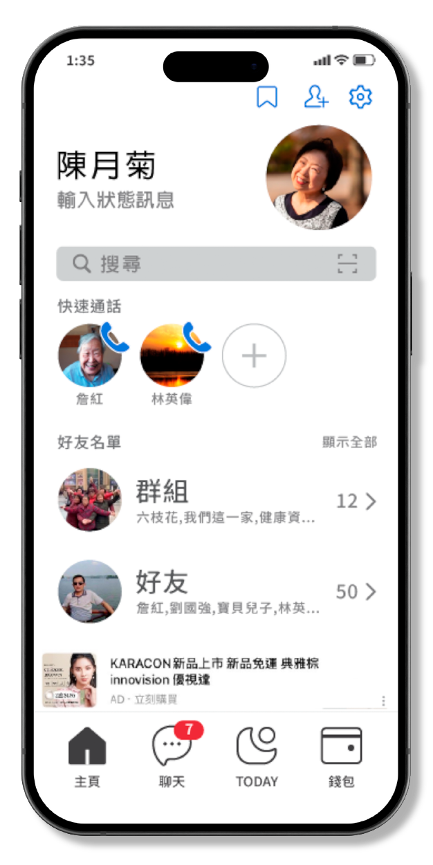
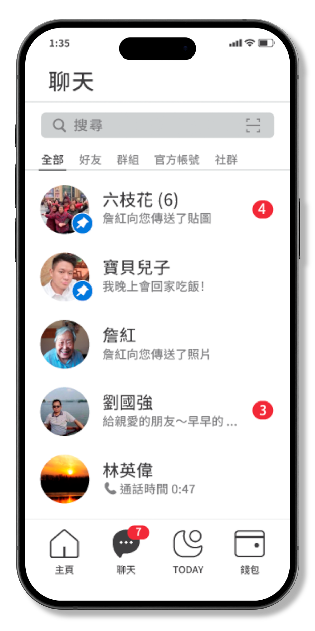
‧ Enlarged user info and toolbar areas, removed low-frequency features, and simplified the top-right menu.
‧ Added a quick-call feature and darkened the search bar background to improve visibility.
‧ Enlarged top areas for clarity, simplified top-right menu for intuitiveness.
‧ Enlarged text and icons for better visibility.
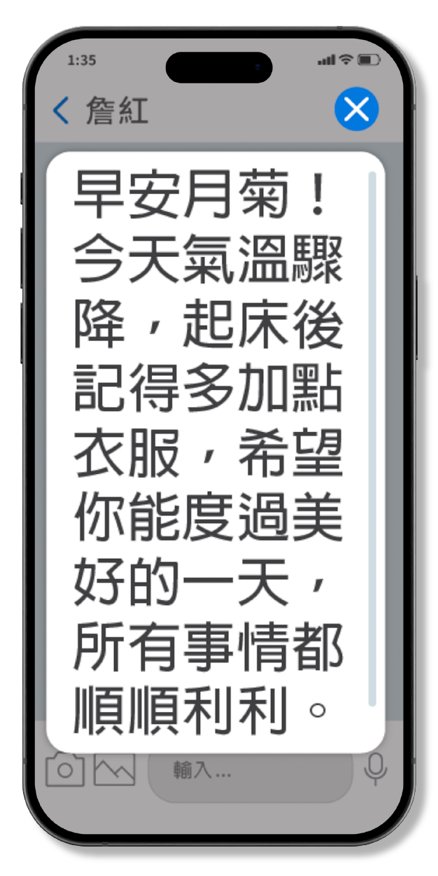
‧ Enabled one-tap magnification of message text for improved readability.
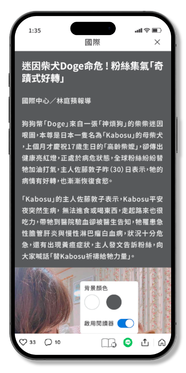
‧ Introduced ad-free reading mode with customizable background colors to reduce eye strain.
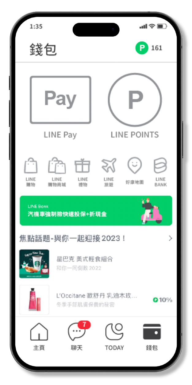
‧ Removed the balance preview to enhance the sense of security for elderly users.
‧ Enlarged key functions like LINE Pay, and relocated shopping features to reduce accidental taps.
Redesigning the features led to noticeable improvements in the user experience, but balancing the varied needs of different user groups was a significant challenge. This project gave me a deeper appreciation for the struggles older adults face with everyday apps that might seem straightforward to others and can often feel confusing or overwhelming for them.
Since this was a course project, the limited sample size made it challenging to gather a wide range of feedback. However, incorporating more surveys and interviews could help uncover better ways to make these tools accessible. Moving forward, focusing on inclusivity and refining the design step by step will be essential for creating a smoother, more user-friendly experience.